MRI Agora Insights
 Available from 7.0.0.0
MRI Agora Insights is an AI-powered data and analytics platform that unlocks and visualizes financial and operational insights from all of your data from your connected MRI products. It provides a unified place to access automated insights at a glance, enabling you to make smarter, data-driven decisions faster.
Agora Insights consolidates data from all your MRI solutions, partner products, and business systems into a single source of truth, delivering powerful dashboards, self-service analytics, and AI-driven understanding of big data to accelerate your strategic decision-making.
Prerequisites for this functionality
-
Okta must be enabled for the client's system
-
The client's system must be configured accordingly
Agora > Insights
The Agora Insights menu provides access to a suite of powerful dashboards and analytics tools that deliver real-time insights across your operations.
The following dashboards are included as the starter set when clients purchase Agora Insights for Evolution:
- FM Work Order Financial Insights - Financial analytics for work order management
- FM Work Order Insights - Operational analytics and KPIs for work orders
- FM Supplier Performance - Supplier performance tracking and analysis
- Asset Strategy Insights - Strategic asset management analytics
- Asset Compliance and Performance - Compliance tracking and asset performance metrics
- Asset Condition Summary - Overview of asset condition across your portfolio
Key Features
Asset Lifecycle Reporting
When it comes to making strategic decisions about your assets, data-driven insights are crucial. But accessing your data isn't always easy - in fact, organizations spend 19% of their working week searching for and gathering information.
With MRI Agora Insights, Facilities Managers can cut down reporting time by up to 80%. Instead of manually collating data, you can make better decisions in just a few clicks. Access your suite of AI-powered reporting dashboards for asset lifecycle insights, spending less time looking for your data and more time putting it to work for your organization.
Enterprise Data Services
A singular data services layer consolidates all your business data in one place, giving you fast access. It supports MRI, client, partner, and public data sets to deliver a unified experience with a holistic approach.
Powerful Dynamic Dashboards
Integrated dashboards show KPIs across all your solutions so you can accelerate financial decisions. View work order volumes, SLA status, financial trends, asset performance, and much more in real-time visualizations.
When it's time to replace an asset, view trends of your historic asset performance to know which make and model has the best energy efficiency and least maintenance requirements. Leadership teams can get a snapshot of their asset compliance status for quick and easy peace of mind.
Self-Service Analytics
With an easy-to-use, independent, self-service data experience, your teams get deeper insights that drive better decisions, reduce risk, and gain a competitive advantage. No business intelligence expertise required.
AI-Driven Understanding
AI-powered analytics uncover trends so you can address potential business problems before they happen. Find the right data quickly and efficiently with AI-powered queries that help you make more informed decisions easily.
Ask Agora is your smart Q&A engine. Use natural language to ask questions and get AI-powered insights so you can understand your data and put it to work. Make better decisions in fewer clicks with multi-application reporting from MRI Agora Insights.
Insights Anywhere
Agora Insights Anywhere gives your teams a quick glance of the data they're looking for with no business intelligence needed. Key features include:
- Contextual Cards - Data cards deliver insights for residents, units, properties, and leases right where you need them
- Unique Identifiers - Quick insights into the things that matter most to your business, like buildings, lease IDs, and tenant names
- Colour Thresholds - Card headings can have colours indicating whether this is a situation requiring immediate action (e.g., a low credit score)
- Contextual Links - Access reports or screens from other systems just by clicking a link within the card
Benefits
- Cut Down Reporting Time by up to 80% - Eliminate manual data collation and make better decisions in just a few clicks
- Gain Better Insights - Unified place to access automated insights at a glance
- Save Time - Spend less time looking for data (reduce the 19% of time typically spent searching for information) and more time making strategic decisions
- Make Smarter Decisions - Data-driven insights that boost growth and protect your revenue
- Faster Decision Making - Find the right data quickly with intuitive tools and AI assistance
- Less Manual Work - Automated data consolidation reduces manual reporting efforts
- Connected Experience - Navigate your point-solution ecosystem with ease
- Historic Performance Analysis - View trends to determine which assets have the best energy efficiency and lowest maintenance requirements
Included Starter Pack Dashboards
FM Work Order Financial Insights
The FM Work Order Financial Insights dashboard provides comprehensive financial analytics for your work order management operations. This dashboard helps you understand spending patterns, budget performance, and financial trends across your facilities management portfolio.
Agora > Insights > FM Work Order Financial Insights
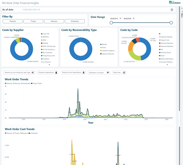
Filter By Options:
The dashboard includes flexible filtering options to analyse costs by different dimensions:
- Payment
- Project
- Machine
- Scheduled
Date Range Filter:
A Date Range component allows you to filter all financial data shown on the page based on a specific date range (e.g., 04/08/23 to 26/08/25).
Key Financial Visualizations:
- Costs by Supplier - Doughnut chart showing spend distribution across all suppliers and contractors
- Costs by Recoverability Type - Breakdown showing recoverable vs. non-recoverable costs:
- Billable
- N/A
- Non-Recoverable
- Expense Recoverable
- Costs by Code - Financial categorization by cost codes such as:
- Training costs
- Remedial events
- Invoice processing
- Scheduled maintenance
- Legal maintenance
- Trade maintenance
- Materials and sub codes
Interactive Analytics Buttons:
- Volume & Cost Trends by Site Year
- Property Expenditure
- Tenant & Site Expenditure
- Estimates vs Actuals
- Max-View
Trend Analysis Charts:
- Work Order Trends - Line graph tracking General Breakdown, Compliance, and Urgent Tasks volumes over time (2021-2025)
- Work Order Cost Trends - Detailed cost analysis by Service, Record, Transfer, and Calculation categories showing spending patterns and spikes
These visualizations provide comprehensive financial oversight, enabling you to identify cost drivers, track spending trends, analyse supplier performance, and make data-driven budgeting decisions.
FM Work Order Insights
The FM Work Order Insights dashboard delivers operational analytics and key performance indicators (KPIs) for your work order management. Monitor volumes, SLA compliance, response times, and operational efficiency metrics in real-time.
This dashboard page is intended to provide a single and clear summary of key metrics associated to the managed properties. The focus is on work orders with more attention on the volume, listings and totals in real time, detailing the Age in days and time intervals distributed in categories.
Agora > Insights > FM Work Order Insights
View By Filter:
The dashboard includes a View By selector that allows you to analyse data by different dimensions:
- All
- Property
- Property Type
- Owner
- Site
Date Range Filter:
A Date Range component allows you to filter all data shown on the page based on a specific date range (e.g., 22/09/21 to 30/08/25).
Key Performance Metrics:
The dashboard displays four critical KPI cards showing real-time totals:
- Total Tasks - Overall count of all work order tasks (e.g., 15857)
- Open Tasks - Current active tasks requiring attention (e.g., 7629)
- Closed Tasks - Completed work orders (e.g., 8218)
- Overdue Tasks - Tasks that have exceeded their due date (e.g., 7351)
Primary Visualizations:
- Work Order Volumes by Month & Year - Stacked bar chart showing historical work order volumes with breakdown by status (On Time, Due, Overdue) across multiple years, enabling year-over-year comparisons
- Work Orders by SLA Status - Stacked bar chart displaying SLA compliance across all sites, showing the distribution of work orders that are on time, due, and overdue for each location
- Work Orders by Discipline - Doughnut chart showing distribution across trade disciplines such as Mechanical, Electrical, General Engineering, Stores, Construction, Plumber, Lift Contractor, Guard, and Architectural
- Work Orders by Category - Doughnut chart breaking down work orders by category including Inspection, Audit, Compliance, Asset Surveys, Fire Hazards, Tenant Refurb, and Cleaning
- Work Orders by Priority - Doughnut chart displaying priority levels (Medium, Low, PPM, Non-Routine, Calibration, Emergency)
- Work Orders by Type - Doughnut chart showing work order types (Reactive, Planned, Scheduled, Urgent)
Detailed Analytics Tables:
- Top 20 Reported Reactive Issues - Comprehensive table listing the most frequently reported issues with columns for:
- Tasks
- Open Tasks
- Overdue Tasks
- Closed Tasks
- Fixed On-time
- Top 20 Reporters in Last 30 Days - Table showing the most active reporters with similar task metrics
Additional Analytics:
- Ask Agora - Natural language Q&A interface for querying your work order data with suggested prompts like "Show me the top 10 Asset codes with the most Breakdown Tasks raised in the last year"
- Work Orders by Status - Doughnut chart showing the breakdown of work orders across different status categories
- Work Orders by Source - Doughnut chart displaying where work orders originated from (various sources including Phone, Email, Portal, etc..)
- Work Orders Trend - Current Year vs Last Year - Dual-line chart comparing monthly work order volumes between current and previous year, with both line and bar visualizations
These comprehensive visualizations and metrics enable facilities managers to monitor operational performance, identify bottlenecks, track SLA compliance, and make data-driven decisions to optimize work order management across their portfolio.
FM Supplier Performance
The FM Supplier Performance dashboard provides comprehensive tracking and analysis of your supplier and contractor performance. Monitor quality, timeliness, compliance, and cost-effectiveness across your supply chain. This dashboard enables you to evaluate supplier reliability, identify performance trends, and make data-driven decisions about supplier relationships.
Agora > Insights > FM Supplier Performance
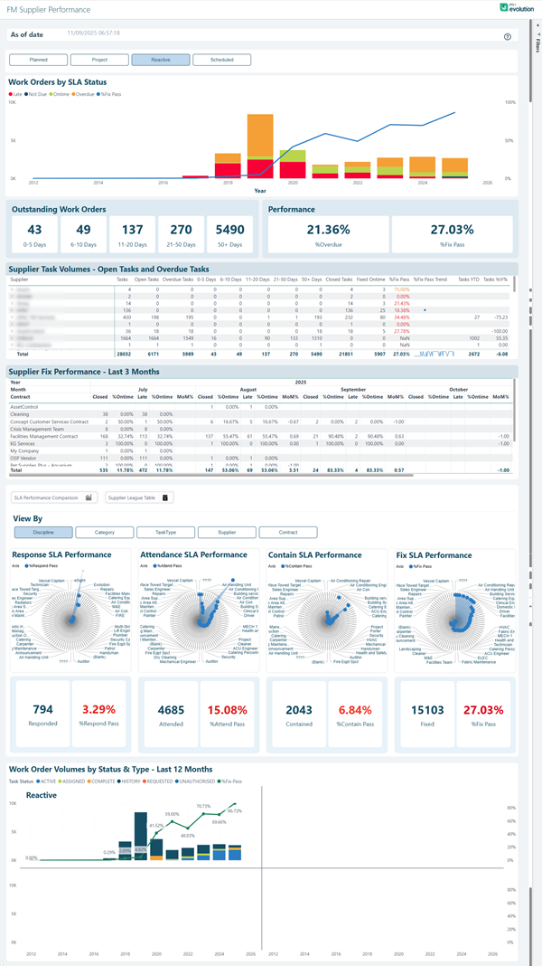
Filter Options:
The dashboard includes flexible filtering buttons to analyse supplier performance:
- Planned
- Project
- Reactive
- Scheduled
Work Orders by SLA Status:
A combination chart displaying work order volumes over time with SLA status breakdown, showing trends from 2012 through 2025 with colour-coded status indicators (Late, Due, On Time, In Breach, SLA Met). The chart includes both stacked bar and line graph visualizations to track volumes and percentage performance.
Outstanding Work Orders:
Real-time age analysis showing the distribution of open work orders by time intervals:
- 0-5 Days - Recently created work orders
- 6-10 Days - Work orders approaching attention threshold
- 11-20 Days - Work orders requiring prioritization
- 21-30 Days - Aged work orders
- 30+ Days - Significantly overdue work orders
Performance Metrics:
Two key performance indicators showing supplier effectiveness:
- %Overdue - Percentage of work orders that have exceeded their due date (e.g., 21.36%)
- %Late - Percentage of work orders completed after the target completion time (e.g., 27.03%)
Supplier Task Volumes - Open Tasks and Overdue Tasks:
Detailed table providing comprehensive metrics for each supplier with columns including:
- Total tasks assigned
- Open tasks count
- Overdue tasks
- Tasks by age categories (0-5 Days, 6-10 Days, 11-20 Days, 21-30 Days, 30+ Days)
- Site days analysis
- Overall performance metrics
- Fixed On-time percentage
- SLA Pass percentage
- Trend indicators
Supplier Fix Performance - Closed Work Orders:
Monthly performance table tracking supplier completion metrics across the year with columns for:
- Closed work orders by month (July through October shown)
- %Overdue - Percentage of work orders completed after the due date
- Late work orders count
- %Ontime - Percentage of work orders completed within SLA
- Monthly totals and cumulative year-to-date (MATD) statistics
View By Options:
Dimension selector allowing you to analyse performance by:
- Discipline
- Category
- Task Type
- Asset
- Contract
Radial Sunburst Performance Charts:
Four interactive radial visualizations providing drill-down analysis:
- Reactive SLA Performance - Breakdown of reactive work orders by pass/fail status with metrics (e.g., 794 responded, 3.29% measured pass)
- Certain SLA Performance - Analysis of certain/scheduled work performance (e.g., 4685 attended, 15.08% measured pass)
- Compliance SLA Performance - Compliance work order tracking (e.g., 2043 completed, 6.84% %certain pass)
- Fix SLA Performance - Work completion performance metrics (e.g., 15103 fixed, 27.03% %Fix Pass)
Work Order Volumes by Status & Type - Last 12 Months:
Combination chart showing monthly work order volumes with breakdown by status (Task Status, OT Ref, In Escalated, In Delayed, In Breach, SLA MET, Breach Received, SLA Pass) and work type (Reactive shown prominently). The chart includes both bar and line visualizations with percentage tracking from 2012 through 2025.
This comprehensive dashboard enables you to monitor supplier reliability, identify under performing contractors, track SLA compliance trends, and make informed decisions about supplier management and contract renewals.
Asset Strategy Insights
The Asset Strategy Insights dashboard delivers strategic analytics to support long-term asset management planning and decision-making. Understand asset lifecycles, replacement strategies, and investment priorities across your entire asset portfolio. This comprehensive dashboard enables you to make informed decisions about capital expenditure, asset replacement timing, and lifecycle optimization.
Agora > Insights > Asset Strategy Insights
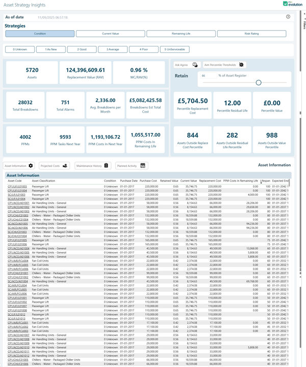
Strategy Filter Options:
The dashboard includes strategic view buttons to analyse different asset management strategies:
- Condition
- Current Value
- Remaining Life
- Risk Rating
Asset Condition Filters:
Quick filter buttons to focus on assets requiring different levels of attention:
- 0-Unknown
- 1-As New
- 2-Good
- 3-Average
- 4-Poor
- 5-Unfit/Condemnable
Key Strategic Metrics:
The dashboard displays critical high-level KPIs for portfolio-wide asset strategy:
- Assets - Total asset count in the portfolio
- Replacement Value (RAV) - Total replacement asset value
- NC(WAR) - Net Current (Weighted Average Rating) performance metric
Asset Portfolio Overview:
- Total Breakdowns - Historical failure count
- Total Alarms - Alert and warning notifications
- Avg Breakdown per Asset - Average failure rate per asset
- Avg Costs - Average maintenance and operational costs
- Total Replacement Value - Sum of all asset replacement values
- Possible Residual Life - Remaining useful life estimation
- Possible Value - Residual value potential
Detailed Asset Metrics:
- PPM - Planned Preventative Maintenance tasks
- PPM Tasks Next Year - Scheduled maintenance for upcoming period
- PPM Costs in Next Year - Projected maintenance expenditure
- PPM Costs Calc in Remaining Life - Lifetime maintenance cost projection
- Assets Outside Routine Life Boundary - Assets requiring replacement attention
- Assets Outside Residual Life Boundary - Assets beyond expected lifespan
- Assets Outside Initial Percentage - Assets deviating from performance benchmarks
Quick Access Buttons:
Interactive navigation buttons for deeper analysis:
- Asset Information
- Property Code
- Maintenance History
- Planned Alarms
Asset Information Table:
Comprehensive detailed table listing all assets with columns including:
- Asset identification codes and descriptions
- Condition rating
- Purchase Date
- Purchase Cost
- Reviewed Value
- Current Value
- Replacement Cost
- PPM Costs in Remaining Life
- Lifespan information
- Expected End date
Natural language query interface with example prompts such as "Ask Agora" for custom asset strategy questions and AI-powered insights.
Asset Action Buttons:
Quick action buttons for asset lifecycle management:
- Retain
- Am Reporting Thresholds
This comprehensive dashboard provides facilities and asset managers with the strategic insights needed to optimize capital planning, prioritize asset replacements, forecast maintenance budgets, and make data-driven decisions about long-term asset investment strategies. The detailed financial projections and lifecycle analysis enable proactive asset management rather than reactive responses to failures.
Asset Compliance and Performance
The Asset Compliance and Performance dashboard tracks compliance status, inspection schedules, and performance metrics across your asset portfolio. Ensure regulatory compliance and maintain optimal asset performance. This comprehensive dashboard provides a complete view of compliance obligations, task completion status, and performance trends to help you manage regulatory requirements effectively.
Agora > Insights > Asset Compliance and Performance
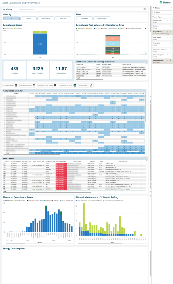
View By Filter:
The dashboard includes view options to analyse compliance data by different dimensions:
- All
- Property
- Asset System
- Asset Type
Filter Options:
Quick filter buttons to focus on specific compliance categories:
- Compliant
- Non Compliant
Compliance Status Overview:
High-level KPI cards displaying critical compliance metrics:
- Compliant - Total count of assets in compliance status
- Non Compliant - Count of assets requiring attention
- % Compliant - Overall compliance rate as a percentage
Compliance Task Volumes by Compliance Type:
Stacked bar chart showing compliance task distribution across different compliance categories (Well Below, Below, On Time, Expired, Non-Safety) with colour-coded status indicators for easy identification of compliance levels.
Certificates Expired or Expiring this Month:
Critical alert section listing assets with certification issues, displaying:
- Asset identification codes
- Certificate dates
- Expiry dates
- Supplying company information
- Urgency status
Navigation Tabs:
Quick access tabs for detailed analysis:
- Green Book Assets
- Compliance History
- Compliance Task Volume
- Compliance By BICS
- Information
Compliance Calendar:
Visual time line displaying compliance tasks and deadlines across multiple years, providing a heat map view of compliance activity with monthly granularity. The calendar shows compliance status patterns and helps identify peak compliance periods for resource planning.
PPM Details Table:
Comprehensive table listing Planned Preventative Maintenance details with columns including:
- Asset codes and descriptions
- Last Service Date
- Next Service Date
- Compliance Type
- Compliance Period
- Property Details
- Discipline
- Code references
- Contractor information
- Status indicators with colour coding (red for overdue/critical items)
Alarms on Compliance Assets:
Bar chart showing fault codes and alarm frequencies across compliance-critical assets, with detailed breakdown by asset categories including emergency lighting, fire alarms, generators, HVAC systems, and other critical infrastructure.
Planned Maintenance - 12 Month Rolling:
Forward-looking bar chart displaying scheduled maintenance volumes for the next 12 months, enabling proactive resource allocation and budget planning.
Energy Consumption:
Performance tracking section for monitoring energy usage and efficiency metrics across compliance-related assets.
This dashboard enables compliance managers and facilities teams to maintain regulatory compliance, track certification expiry dates, monitor inspection schedules, identify non-compliance risks, and ensure all statutory obligations are met on time. The visual calendar and alert systems provide early warning of upcoming deadlines, while the detailed tables support audit trails and compliance reporting requirements.
Asset Condition Summary
The Asset Condition Summary provides a comprehensive overview of asset condition and health across your entire portfolio. Monitor condition grades, deterioration trends, and maintenance needs. This dashboard enables asset managers to assess portfolio health, plan strategic replacements, and optimize capital investment decisions based on asset condition data.
Agora > Insights > Asset Condition Summary
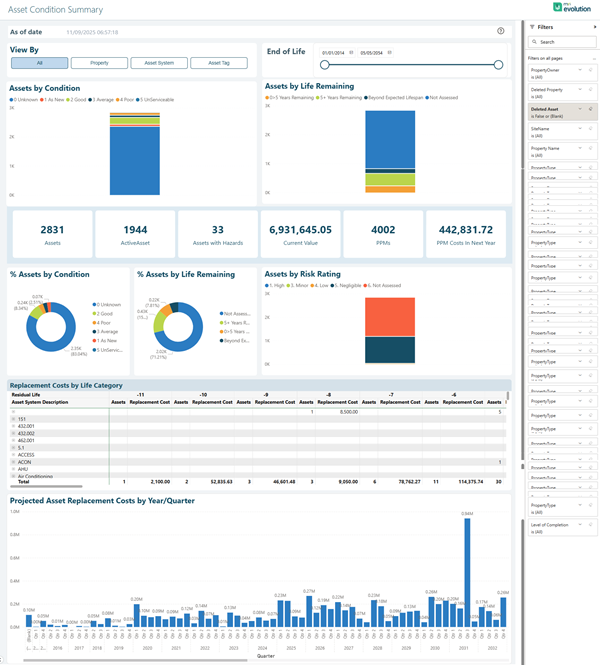
View By Filter:
The dashboard includes view options to analyse condition data by different dimensions:
- All
- Property
- Asset System
- Asset Type
End of Life Slider:
Interactive slider control to filter assets based on remaining life expectancy, allowing you to focus on assets approaching end of life or those with extended serviceable life remaining.
Assets by Condition:
Stacked bar chart showing the distribution of assets across condition grades with colour-coded categories:
- 1-As New
- 2-Good
- 3-Fair
- 4-Poor
- 5-Life Expired
- 0-Undetermined
Assets by Life Remaining:
Stacked bar chart displaying assets categorized by remaining useful life:
- 0-5% Life Remaining (critical replacement priority)
- 5-10% Life Remaining
- 10-25% Life Remaining
- 25-50% Life Remaining
- 50%+ Life Remaining (Extended Useful)
- Not Assessed
Key Condition Metrics:
High-level KPI cards providing portfolio-wide condition statistics:
- Assets - Total count of assets in portfolio
- Substandard - Count of assets rated as poor or life expired
- Assets with Records - Number of assets with documented condition assessments
- Replacement Value Total (RV) - Total portfolio replacement value
- Assets by Risk Rating - Count of high-risk assets requiring attention
- Average Costs - Mean replacement cost per asset
% Assets by Condition:
Doughnut chart showing percentage distribution across all condition grades, providing at-a-glance portfolio health assessment.
% Assets by Life Remaining:
Doughnut chart displaying percentage of assets in each life remaining category, highlighting replacement planning priorities.
Assets by Risk Rating:
Stacked bar chart with risk categorization:
- High (critical attention required)
- Medium (monitoring recommended)
- Low (acceptable condition)
- Negligible (minimal concern)
- Not Assessed
Replacement Costs by Life Category:
Detailed table breaking down replacement costs by asset type and life remaining percentage categories, with columns showing:
- Asset System Description
- Replacement costs for each life remaining band (0%, 5%, 10%, 20%, 30%, 40%, 50%, 60%+)
- Total replacement cost per asset category
Projected Asset Replacement Costs by Year/Quarter:
Forward-looking bar chart displaying projected replacement expenditure over multiple years and quarters, enabling long-term capital planning and budget forecasting. The chart shows historical baseline and future projections to help identify peak spending periods and plan budget allocation accordingly.
This comprehensive dashboard provides asset managers and facilities leadership with the critical insights needed to assess overall portfolio health, prioritize capital investments, plan strategic replacements, and optimize maintenance budgets based on asset condition trends. The combination of condition ratings, life remaining analysis, and cost projections enables data-driven asset replacement strategies that balance risk, performance, and financial constraints.