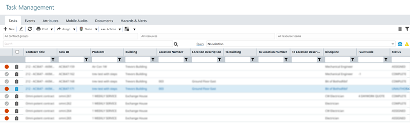
Customising Grids
MRI Evolution records are displayed in a customisable grid format.
All grids within MRI Evolution have functionality to enable a User to personalise the grid and print or export data from that grid.
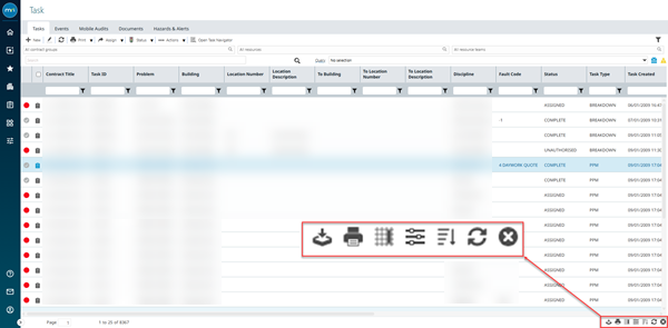
The icons to enable a User to use this functionality are found in the bottom right corner of the grid.
| Icon | Name | Description |
|---|---|---|
 |
Export to CSV | Allows the grid data to be exported to a CSV file. |
 |
Allows the grid to be printed. | |
 |
Set Default Columns | Allows the grids default columns to be altered for all Users. |
 |
Personalise | Allows a User to set grid columns to their personal preference. |
|
Enable / Disable Multi Column Sort | Switches the grid from sorting by a single column, to sorting by multiple columns. |
 |
Turn Auto Refresh On / Off | Switches off the grids auto-filtering function. |
 |
Clear All Filters | Clears all applied filters on the grid. |
Export to CSV
 Click to view more detail.
A grid's contents can be exported to a CSV (comma separated values) file.
Click Export to CSV , the User will be prompted to open (compatible programme such as MS Excel required) or save the CSV file.
Click to view more detail.
A User can print the grid
Click Print , a pop up will appear with a preview of the grid, click Print and a pop up will open with the options to print to connected printers.
Set Default Columns
Click to view more detail.
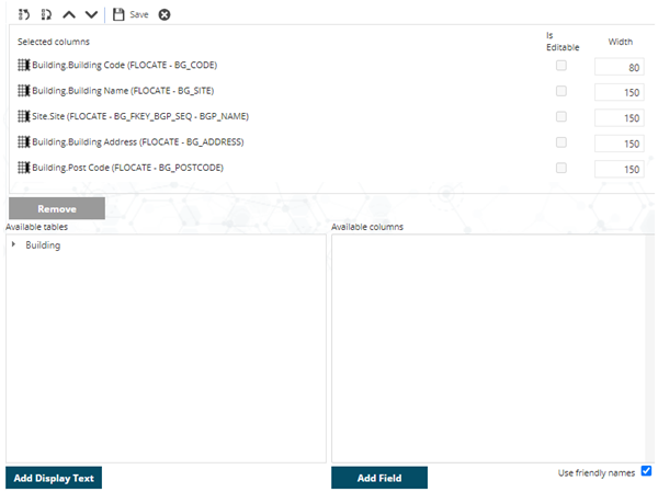
Default grids for all MRI Evolution Users can be set using Set Default Columns function, it is suggested that this Permission is only given to System Administrators.
Click Set Default Columns , a pop up window appears which allows the set up of default grids.

To add a column, select it in the Available Columns section and click Add.
To remove a column, select it in the Selected Columns section and click Remove.
To change the order of a column, select it in Selected Columns and use any of the Move up  , Move down
  , Move to First
  , or Move to Last
  buttons to arrange where the column will appear.
The order of the Columns in the Selected Columns section, will be the order of the columns in the grid.
Available from 5.0.0.0 Selected columns can be made editable directly from the grid, check the box to make the field editable
Administrators can define which fields are editable in the grid from Table Fields ( for more information see Table Fields)
When you finished the arrangement, click Save  .
.
Personalising the Grid
Click to view more detail.
Users with the necessary Permission granted are able to customise Grids within MRI Evolution so only data relevant to them is displayed, and the columns are in the required order.
Click Personalise , to open a pop up window which allows the set up of personalised grids.
To add a column, select it in the Available Columns section and click Add.
To remove a column, select it in the Selected Columns section and click Remove.
To change the order of a column, select it in the Selected Columns section and use any of the Move up , Move down , Move to First , or Move to Last buttons to arrange where the column will appear.
Click  to remove any grid personalisation applied to the current grid, back to the system default. Available from 5.5.1.0
The order of the Columns in the Selected Columns section, will be the order of the columns in the grid.
Available from 5.0.0.0 Selected columns can be made editable directly from the grid, check the box to make the field editable
Administrators can define which fields are editable from Table Fields ( for more information see Table Fields)
When you finished the arrangement, click Save .
Filter, Editing and Display Controls
Click to view more detail.
Available from 5.0.0.0
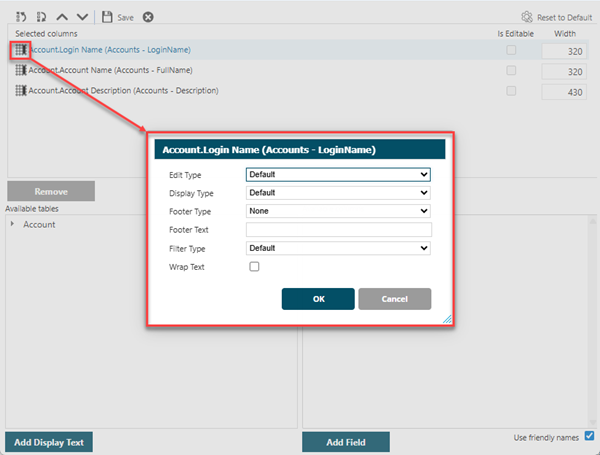
If enabled, a User can enhance the filter and editing features in their grid. The drop down options will alter dependant on the field selected.
From the Selected Columns window click Default Columns to the left of the field, a pop up window will allow the filter and display features to be modified.
The Multi-Select Type Function will only work with direct foreign keys e.g. AR_FKEY_BG_SEQ
Clicking Add Display Text whilst an Available Table is highlighted will add the foreign key directly to Selected Columns
Edit Type
From the drop down, users can set the appropriate type for entering data directly in grids, the default option for the field is set in the Edit Type within Table Fields.
The values in the drop down are context sensitive and will depend upon the type of data that is stored in the field.
For example, a text field, such as a Description, will have the following options to choose from:
-
Default
-
Text Box
-
Comment
Numeric fields will have a different set of drop down options to choose from, as would date fields and so on.
Display Type
Users can optionally set the field display type for displaying data in grids, the default option for the field is set in the Display Type within Table Fields.
The values in the drop down are context sensitive and will depend upon the type of data that is stored in the field.
For example, a 'binary' field will have the following options to choose from:
-
Default
-
True or False
-
Check-box
Available from 6.4.0.0
A Display Type of Currency has been added.
Footer Type
Grid columns that contain Numerical data can have the column's data summarised in the column's footer Footer Type in Table Fields.
The summarised value in the Footer will reflect the data displayed in the grid. In other words, if the grid is filtered in some way and showing less records, the summarised value will be based upon the data in the filtered grid.
Select from the following aggregation options:
- None
- Sum
- Maximum
- Minimum
- Average
Footer Text
A Text label can be added to the column footer to appear before the defined Footer Type aggregate summary, the default option for the field is set in the Footer Text within Table Fields.
The label will only be displayed when a Footer Type that is not None is defined for the column.
Filter Type
Users can optionally set the grid column heading filter type for the current field, the default option for the field is set in the Filter Type within Table Fields.
The values in the drop down are context sensitive and will depend upon the type of data that is stored in the field.
For example, a date field will have the following options to choose from:
-
Default
-
Single Date
-
Date Range
-
Date Time Range
Some other examples of grid Filter Type options for different types of data are as follows:
-
Number Range
-
Auto-Complete
-
Multi-Select
Wrap Text
 Available from 7.0.0.0
Users can check the box to enable the text in this field to wrap and have the grid row vertically to accommodate the text when the field appears as a column in a grid, the default option for the field is set in the Wrap Text within Table Fields.
Sorting the Grid
Click to view more detail.
Clicking on any of the column headers will sort the entire grid in order based on that column. First click will order the column in ascending order, clicking a second time will re-order in descending order.
Available from 6.2.0.0
Grids can now be sorted by foreign key related entities.
For example:
The Asset (FASSET) entity has a Sort By Column value defined.
Asset has been added to the Tasks grid as a foreign key relationship.
A user can click on the Asset column header in the Tasks grid and the Tasks grid will be sorted by the Sort By Column defined against the Asset entity.
With no Sort By Column value selected, the first/only column of the Display Format defined will be used to sort.
Multi Column Sort
Click to view more detail.
It is possible to sort by multiple columns within the grid. In order to use this function, click Enable Multi Column Sort , Clicking on multiple columns then allows you to sort the data e.g. by Building and then by Status or Priority.
To return to sorting by a single column click Disable the Multi Column Sort .
Auto Refreshing the Grid
Click to view more detail.
By default once a filter is entered into the grid, the grid will refresh to the applied filter, to turn off this function, click Turn Auto Refresh Off . The grid will now need to be manually refreshed when filters are applied. To return the grid to the default setting click Turn Auto Refresh On .
Removing Filters
Click to view more detail.
Once a filter has been applied it can be manually removed by deleting the filter information from the search box, alternately click Clear All Filters , this will remove all filters and refresh the grid.
Standard and Condensed Toggle View
Click to view more detail.
Available from 7.0.0.0
When in Master Grids, Users now have the option to toggle their grid style between Standard and Condensed views. Their preference will be persisted and stored in their user preferences.
Standard view has more spacing around the text in the column headers and grid rows. The amount of data/rows visible in the grid is reduced in Standard view when compared to Condensed view but may be easier to read.
Toggle Button
The toggle button can be found in the location highlighted below (in left-to-right mode):
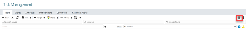
Clicking the button flips the view from Standard to Condensed and vice-versa.
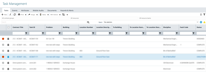
Standard View
Standard view has more spacing around the text in the column headers and grid rows. The amount of data/rows visible in the grid is reduced in Standard view when compared to Condensed view.
Condensed View
There is less padding above and below the text in the column headers and rows in the grid when in Condensed view, therefore more rows are visible but it may be less easy to read.